Through a regularly updated collection of case studies, interviews and analysis The Why Axis aims to enrich the discussion surrounding the current state of data visualization. Each project featured will be used to help uncover the attributes of a effective data visualization both in terms of aesthetics and functionality. All articles focus on larger data visualization projects, and when possible, illuminate the working process rich with decisions and compromises straight from the mouth of the designer. Our ideal visualization is visually refined, supremely useful and undeniably enlightening.
The Why Axis is operated by Bryan Connor, a designer and developer from Baltimore."
The Why Axis is operated by Bryan Connor, a designer and developer from Baltimore."
Unfortunately I seem to have found this site in its infancy. Connor has already been analysing infographics but I can't find any solid critical theory yet.
Alex Dragulescu'Spam Architecture'
"The images from the Spam Architecture series are generated by a computer program that accepts as input, junk email. Various patterns, keywords and rhythms found in the text are translated into three-dimensional modeling gestures."


Alex Dragulescu is a Romanian visual artist whose practice embraces both traditional and new media. His projects are experiments and explorations of algorithms, computational models, simulations and information visualizations that involve data derived from databases, spam emails, blogs and video game assets.
"...somewhere between pure art and information visualization" Dragulescu
Lise Autogena
Black Shoals Stock Market Planetarium

"Black Shoals Stock Market Planetarium is an animated night sky that is also a live representation of the worlds stock markets, with each star representing a traded company. Fed by massive streams of live financial information, the stars glimmer and pulse, immediately flickering brighter whenever their stock is traded anywhere in the world. The stars slowly move across the sky, clustering together or drifting apart in response to the shifting affinities of their respective companies, growing or shrinking as the company’s fortunes change. Digital creatures, a form of artificial life, inhabit this world, feeding on the light released by the stars, breeding, dying and slowly evolving. while trying to learn to live in this strange artificial ecology into which they’ve been born.
The Stars
The Stars
The planetarium displays listed companies as stars that drift across the sky in response to the complex currents of the market. The stronger the correlation between the histories of stock prices of any two companies, the more powerful the gravitational attraction between them. Whenever a stock is traded somewhere in the world, the corresponding star in the dome immediately glows brighter. A trade of a minimum of $700.000 will produce light in the planetarium - the brightness and duration of the glow indicating the volume of trading activity taking place. The stars in the planetarium slowly move across the sky in response to the currents of the markets - clustering and dividing according to the relationships between the companies they represent, while outlining the shapes of different industries and the huge multinational conglomerates like the signs of the zodiac. In this way, any general movement in a section of the market has a visible effect on the sky – a Parmalat scandal, or the recent collapse of Enron, for instance, would cause all the companies affected to glow very brightly and to be pulled towards each other into a very powerful vortex."

Lise Autogena
Most Blue Skies

"Most Blue Skies is a computer generated project that attempts to identify “the most blue skies” in the world. The first stage of the project was exhibited at The Gwangju Biennale in South Korea in 2006. In the exhibition, a cluster of computers used live satellite data with advanced atmospheric simulations to continuously calculate sky colour for five million places around the world, while displaying ongoing calculations and a global map of sky colours. The name of the location of the current bluest sky was projected beneath a square wall illuminated by a specially developed lighting system reproducing the colour of the bluest sky in real time. Fed by live global atmospheric data, the installation calculated the passage of light through particulate matter in the atmosphere and calculated sky colours for millions of places on earth. By comparing millions of these calculations, the project identified the intensity and location of the “most blue skies” in the world."

Christiane Keller
"dataMorphose is an interactive installation which projects data into real space and visualizes it three-dimensionally. Information is represented by spanned and moving sails directly in the room. Thus abstract and virtual data becomes real and tangible. As the user takes new positions and perspectives, he can experience a completely novel and sensual perception of data.
Three spatial displays visualize statistical data, web activities and the current time. The coding and procurement of data is visualized by the tension of the canvas, the pace of movement, the position of the canvas and the change of their shape."

dataMorphose from Christiane Keller on Vimeo.
Christiane Keller - In The Future
In The Future 100×100 is a data sculpture which visualizes 100 years of forward thought. Using web-crawls of Google News, Google Blog and Google Scholar, the phrase “in the future” was associated with key words and phrases which reveal previous though about the future of our world. The top 100 terms for each year were categorized using the Dewey Decimal system, and mapped onto a grid. Holes were drilled into sheets of plexiglass whose sizes correspond to their frequency. For example, “war” is the biggest hole in 1945.
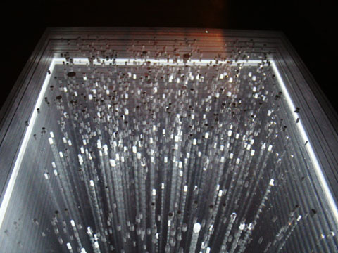
Christiane Keller - Bus Structure 2pm - 2am
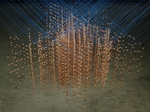
A 3D data sculpture of the Sunday Minneapolis / St. Paul public transit system, where the horizontal axes represent directional movement and the vertical represents time. It is constructed of 47 horizontal layers, each forming a map of the bus routes that run during a given interval of time. Within each layer, every transit route that operates at that time is represented by wood balls placed at its scheduled stops, connected by the horizontal copper rods.
Christiane Keller - Tidal Datums

Tidal Datums is a wooden table whose form is inspired by the formal language of data graphics. The table is intended to be a representation of analytic information through the medium of furniture. Data graphs were gathered from NOAA’s historic tide database, more specifically the measurements of tides at San Francisco Bay over a 4 week period, and then translated into tangible material. The forms modeled from the data not only reveal a dynamic pattern, but also facilitate a “new way” of experiencing information by enabling a physical interaction of tidal patterns with the body.
The good thing about Keller's website is that, like David McCandless, he publishes his thoughts during the process of making, what he intends to communicate, diagrams, tests of materials and so on.
The good thing about Keller's website is that, like David McCandless, he publishes his thoughts during the process of making, what he intends to communicate, diagrams, tests of materials and so on.
No comments:
Post a Comment