In her earlier well-known project 1:1 Jevbratt created a dynamic database containing IP addresses for all the hosts on the World Wide Web, along with five different ways to visualize this information.
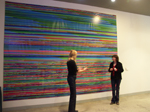
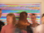
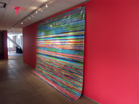
'When navigating the web through the database, one experiences a very different web than when navigating it with the "road maps" provided by search engines and portals. Instead of advertisements, pornography, and pictures of people's pets, this web is an abundance of non-accessible information, undeveloped sites, and cryptic messages intended for someone else…The interfaces/visualizations are not maps of the web but are, in some sense, the web. They are super-realistic and yet function in ways images could not function in any other environment or time. They are a new kind of image of the web and they are a new kind of image.'
In a 2001 project Mapping the Web Infome Jevbratt continues to work with databases, data gathering and data visualization tools; and she again focuses on the Web as the most interesting data depository corpus available today.7 For this project Jevbratt wrote special software that enables easy menu-based creation of Web crawlers and visualization of the collected data (crawler is a computer programs which automatically moves from a Web site to a Web site collecting data from them). She then invited a number of artists to use this software to create their own crawlers and also to visualize the collected data in different ways. This project exemplifies a new functioning of an artist as a designer of software environments that are then made available to others."
- Lev Manovich, Data Visualisation as New Abstraction and Anti-Sublime
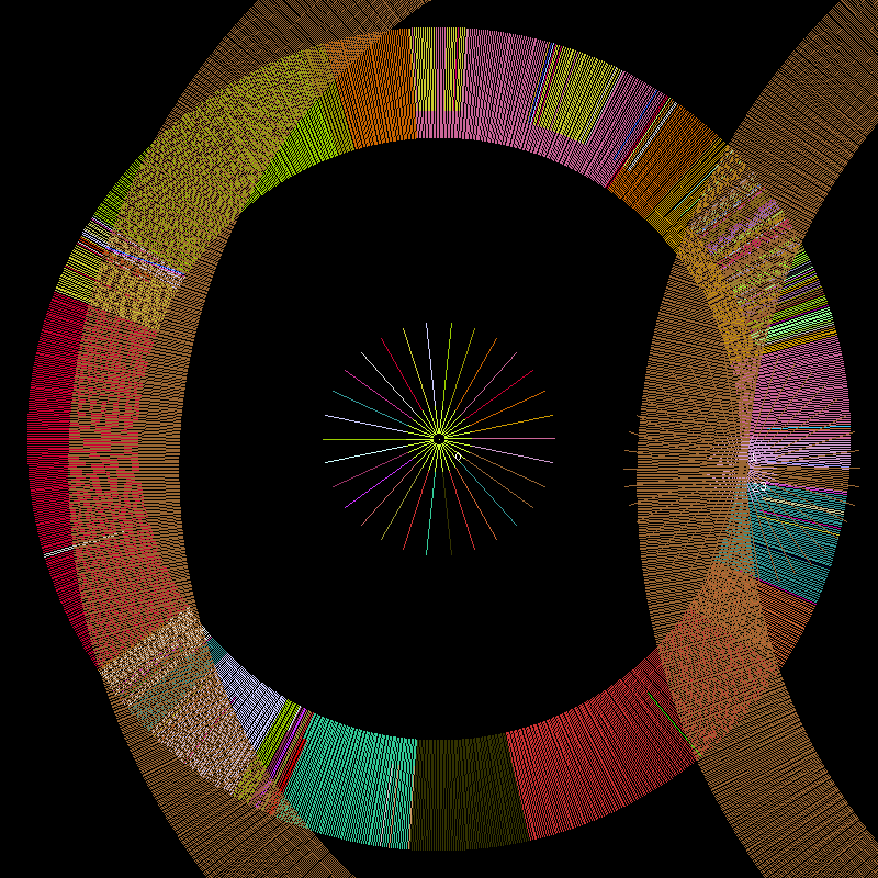
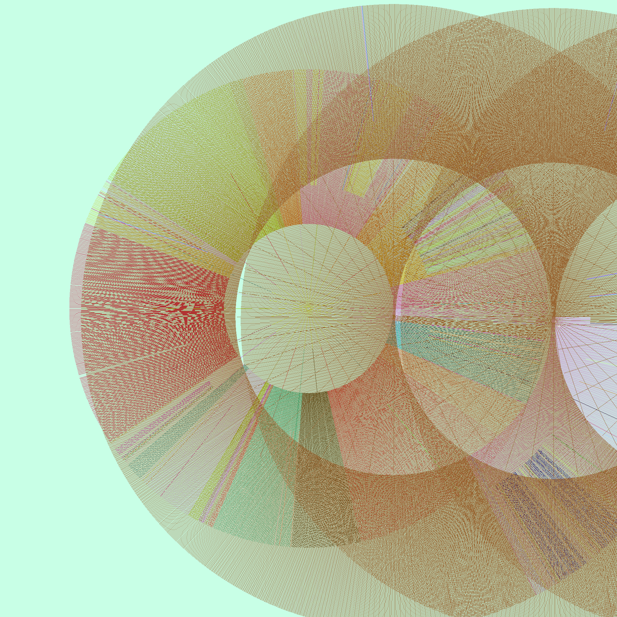

Web Visualization Software (2002 - 2006)
The Infome Imager allows the user to create "crawlers" (software robots, which could be thought of as automated Web browsers) that gather data from the Web, and it provides methods for visualizing the collected data.
"The . project 1:1, created in 1999, consisted of a database that would eventually
contain the addresses of every website in the world and interfaces through
which to view and use the database. Crawlers (software robots, which could
be thought of as automated web-browsers) were sent out on the Internet to
determine whether there was a website at a specific IP address (the
numerical address all computers connected to the Internet use to identify
themselves). If a site existed, whether it was accessible to the public or not,
the address was stored in the database. The crawlers didn't start on the first
IP address going to the last. They searched instead for selected samples of
all the IP addresses, slowly zooming in on the numerical range. Because of
the interlaced nature of the search, the database could, in itself and at any
given point, be considered a snapshot or portrait of the Web, revealing not a
slice but an image of the Web with increasing resolution...
The image is composed of pixels each representing one website address stored in
the IP database. The location of a pixel is determined by the IP address it
represents. The lowest IP address in the database is represented in the top
left corner and the highest in the lower right. The color of a pixel is a direct
translation of the IP address it represents, the color value is created by using
the second part of the IP address for the red value, the third for the green,
and the fourth for the blue value. The variations in the complexity of the
striation patterns are indicative of the numerical distribution of websites
over the available spectrum. An uneven and varied topography is indicative
of larger gaps in the numerical space i.e. the servers represented there are
far apart, while smoother tonal transitions are indicative of networks hosting
many servers, which because of the density have similar IP addressesVisualization
The 1:1 and the Infome Imager visualizations are realistic in that they have
a direct correspondence to the reality they are mapping. Each visual element
has a one-to-one correlation to what it represents. The positioning, color,
and shape of the visual elements have one graspable function. Yet the
images are not realistic representations; they are real, objects for
interpretation, not interpretations. They should be experienced, not viewed
as dialogue about experience. This is interesting in several ways. On a more
fundamental level, it allows the image to teach us something about the data
by letting the complexity and information in the data itself emerge. It allows
us to use our vision to think. Secondary, it makes the visualizations function
as art in more interesting ways, connecting them to artistic traditions from
pre-modern art, such as cave paintings, to abstract expressionism, action
painting, minimalism, and to post-structuralist deconstructions of power
structures embedded in data. The visual look that follows from this thinking
is minimal. It is strict and “limited” in order not to impose its structure on its
possible interpretations and meanings. The visualizations avoid looking like
something we have seen before, or they playfully allude to some
recognizable form but yet slip away from it.
The abstract reality in which these images emerge is not a Platonist space of
ideal forms, and the images are not the shadows of such forms. The term
‘visualization’ is problematic, and would be beneficial to avoid, because it
indicates that the data has a pure existence, waiting to be translated into any
shape or sound (or whatever medium the latest techniques of
experiensalization would produce). The opposite view that argues that the
data is not there if we don’t experience it—could be fruitful as long as it is
not seen as a solipsist statement, but rather as a position more affiliated with
ideas from quantum mechanics. The Heisenberg uncertainty principle
implies that we can only be certain about something’s existence if we see it.
Everything else is known only with some degree of probability. In the first
of these arguments—the data-purist view, images are merely one possible
expression of the data behind it. The images get their meaning in a vertical
manner; the truth is in the data, outside the image, behind or below it. In the
second view, the contextualist stand, images cannot escape their context, the
methods producing them and the discourse they are produced within. They
get their meaning in a horizontal manner. The meaning is created from how
the image refers to its image-ness and the tradition in which it was created.
The most interesting examples of visuals displaying data, negotiate between
these opposite positions."
Inquiries in Infomics
Lisa Jevbratt (2004
DATA BEAUTIFUL - An Adventure in Info Aesthetics
Lev Manovich - From Jevbratt's website
"A Web crawler is beautiful. Quantitative data is beautiful. Multiple windows of GUI are beautiful. Email clients are beautiful. Instant Messenger is beautiful. Information is beautiful.
Let the thousand data windows open; let the thousand gassian curves spring up; let the thousand pockets move through the network; let the thousand matrixes multiply themselves. Information tools and information interfaces is the future of aesthetics.
Normally we think of Web crawler and data visualizations as functional tools. Web crawlers classify the Web; data visualization In contrast, we are told, art is non-functional. (Of course this rarely has been true: not only art routinely has been used to propagate various ideologies - Christianity, Capitalism, Communism - but artists also taught people how to interact with complex bodies of information. History of art is the history of research in information interfaces. Giotto was the leading information designer of his days.)
So how can we make art out of a Web crawler and data visualization tools? In my project I de-functionalize them.
Firstly, my Web crawler does not look for any particular "content"; its goal is simply to generate a data set, which will lead to a beautiful visualization. Whether this data set consists
Secondly, I think of the "walk" crawler takes through the information space of the Web as an elaborate dance, and something beautiful in itself. In other words, the goal is to discover the beauty of the trajectory, rather than to treat this trajectory simply as a means to an end.
Think of this as pure "data formalism." Modernists artists treated a figurative image as an abstraction, i.e., a collection of shapes, colors, lines which are arranged together and which also happen to represent some familiar reality. Similarly, behind the seemingly functional search trajectories and search results of Web crawlers lie abstract patterns, as beautiful as compositions of Kandinsky and Pollock, the shapes of Frank Gerry and Iseey Miyake, or the sounds of Philip Glass.
Yet remember that this is just a first step towards discovering info-aesthetics. Ultimately we would not to submit information to the standards of conventional, classical beauty. Ultimately, we will have to discover what the new beauty of information is. It may turn out to have nothing to do with a smile of a girl on a beach or the shape of iMac or the machine-like sounds of Kraftwerk. If we are unlucky, it may be something that even our machines will find ugly. At this point, we just don't know yet."
Inquiries in Infomics
Lisa Jevbratt (2004)
Chapter in Network Art: Practices and Positions edited by Tom Corby,
Routledge 2005
"Infomics
Within the Infome, artist programmers are more land-artists than writers;
software are more earthworks than narratives. The ‘soil’ we move, displace,
and map is not the soil created by geological processes. It is made up of
language, communication protocols, and written agreements. The mapping
and displacement of this ‘soil’ has the potential of inheriting, revealing, and
questioning the political and economic assumptions that went into its
construction. Moreover, this environment/organism is a fundamentally new
type of reality where our methods and theories regarding expression,
signification, and meaning beg to be redefined...
Imagine yourself flying over a landscape, your eyes following the mountain
ridges and the crevasses formed by water running down the slopes over
millions of years. (Figure 7.1) There are roads crossing the landscape, some
of them closely following the creeks and the valleys, some boldly breaking
the patterns of the landscape, laid on top of it as if drawn on a map. (Figure
7.2) There are circular fields, the result of the mechanics of manmade
irrigation systems, and oddly shaped fields wedged between lakes and
mountain slopes. It is a fascinating display of the interplay between nature
and culture, showing off the conditions of human life, our histories, and
philosophies of living and relationship to nature. Open any atlas and one
will see attempts to map this rich connection between geology and
anthropology. These images, the view from above and the maps, allows us
to see the layers of our environment, of how we have responded to the
geology, the climate we live in, and how we have manipulated nature
depending on our beliefs at different moments in time.
The Infome is made up of layers of protocols and languages, each
functioning as the nature, the conditions for the next layer, and all of them
together forming the conditions, the nature, which we relate to when
spending time in (for example by navigating the Web), or using (by sending
an email or transferring a file), the environment. We as people are expressed
in this environment as a collective through how we use it, just as flying over
a landscape reveals our cultures and their histories through the specific
placement of roads, the shape of the fields, and conglomeration of buildings.
In addition, we—humans —are also expressed in its very construction,
geology, and climate. We wrote its mountains and its rain....
The type of imagery produced in genetics and biochemistry, sometimes
called ‘peripheral evidences,’ are imprints of DNA and proteins.
Two-dimensional polyacrylamide gelelectrophoresis, colorectal
adenocarcinoma cell line
cDNA microarray. Daphnia Genomics Consortium.
These images are evidence of something outside themselves, something
(truth?) that could be visualized in multiple ways. Yet, because they do not
escape the methods used to create the imagery, what they articulate could
not be said in any other way. Another beautiful example of this simple but
complex type of representation is found on TV. The static we see on the TV
screen when zapping through non-existing channels allows us to see the Big
Bang, the birth of the universe (Figure 7.10). In the static, 1 per cent cosmic
background radiation is hidden. The visual noise we see is not how we
would choose to represent the Big Bang; it is not a visualization of it. It is in
fact a direct experience of it...
A Shift
The trajectory through history to the computer as a symbolic manipulation
machine led us through several more or less explicit mystical traditions and
practices. It takes us from the Pythagoreans (500 BC) with their number
mysticism and Plato (428-348 BC) and his ideal forms. It touches the
universal art of Raymond Lull (1235-1316), a model of understanding that
anticipated symbolic logic, and the memory art of Giordano Bruno (1548-
1600). These discourses served as a foundation for Gottfried Leibniz (1646-
1716) when he conceived of the lingua characteristica (a language that
could formally express all knowledge), calculus ratiocinator (an allencompassing problem-solving machine/system) and his calculus.
Leibniz’s work was highly influential on Charles Babbage (1791-1871) and
his ideas leading to the Analytical Engine and George Boole (1815-64) and
his theories of binary logic, both cornerstones in the development of modern
day computers. The logic conveyed in all these traditions stems from a
belief system where there are concepts and thoughts behind physical reality,
a system of symbols more real than the reality experience by our senses.
This symbolic layer can be manipulated and understood by modifying its
symbols. There is a thought entity outside nature, a power that is either in
the form of a god, gnosis, a oneness, or in the likeness of a god, as humans.
However, if computers are now the access-points to the Infome, and coding
and code are processes and entities used to experience and manipulate the
reality of a multi-layered environment/organism, then the metaphysical is no
longer an all-knowing entity outside, dictating the system, but an
emergence, an occurrence within it: a scent, a whisper, a path in-between
for a shaman to uncover. And what she, or he, finds is not an absolute but a
maybe, made of hints, suggestions, and openings."
A Prospect of the Sublime in Data Visualizations
(Slides and notes from presentation in Boulder 2005)
Lisa Jevbratt 2004/2005
"We look up at the starry sky and we sense a fear of not comprehending and being
engulfed, a fear of the unknown, and simultaneously we experience a longing for that
inaccessible, impenetrable darkness.
These are the classical visuals of the sublime. Images of a sense of grandeur we can’t
reach, which we can’t penetrate or grasp. It is in the very far distant, it is hidden in layers
of mist, or made inaccessible by a climate not suited for us, and it instills a sensation of
deep fear. Yet we urge for it, we are fascinated and attracted by it.
The datasets we are looking at now, data generated from looking in and down at us, the
earth and our technologies, are of no less dimension, vastness and grandeur than the
“datasets” that were the subject of the classical sublime: impressions of the nature out
there, the universe up there; and the sensations of the sublime generated and described
by the romantic artist, philosophers and writers are of great interest to us when trying to
make sense of our datasets today whether it is through computation, analysis or, as in my
case, visualization.
Attraction/Repulsion
However, while the datasets of today are as substantial, complex and ungraspable as the
ones dealt with in the original romantic sublime, there is a difference in direction, and
also in the forces activated and the methods in which to engage the sublime.
In the original sublime the force operating in us is attraction. The object of desire is over
there, far away and we want to reach it. We want to go there, we are scared and
intimidated but our longing and effort is ‘towards’.
When our force (engine, energy, luck) fails the ship stops, it does not get closer. The
forces of nature push us away - we urge to approach.
One could say that the original sublime was the extreme tension, and the pain that tension
causes, of not knowing and wanting to know.
Now, looking in and down the force operating in us is reversed, its repulsion.
If the engine in a plane stops, it approaches the ground; the natural force is gravity and
we need to stay up and away. We are pulled down and respond by retracting. The forces
of nature pull us down and in, and we urge to repel.
The sublime now is the extreme tension, and the pain that tension causes, between
(hypothetical) familiarity - the earth is our home, the cells and DNA are in our bodies, the
networks are our creation - and a methodological distancing.
Let me explain this a little further using this slide.
True) <- (We = (False -> We)
The original sublime operated in an epistemological and ontological condition in which
there was a separation between us and whatever it is was we wanted to know something
about, just as it was a split between culture and nature. And, we were certain there was
something to know out there, outside ourselves and to be able to gain knowledge about it
we needed to approach it. Today, we have a somewhat inverted epistemological and
ontological condition and thus the sublime that operates within it is an inverted sublime.
We know now, learning from fields as varied as post-structuralism and quantum physics,
that we are always part of the system we are looking at. The way we look at something
changes the thing we are looking at. We also know that, by looking at something we will
potentially know less about it. I recently heard an astronomer mention in a talk that we
know approximately what 3 percent of the universe is, what it consist of. Just a few years
ago that number was 5 percent. The logical response to this inverted
epistemological/ontological condition is that we now need to retract. Not approach.
In the original sublime we wanted to go “there” because we wanted to know.
In the inverted sublime we don’t want to go there because we don’t want to not know.11
So why are we trying to find methods that are allowing the sublime to operate today?
And what could those methods be?
Esthetic decision-making
In the article “Systems Esthetics” from 1968, its author, Jack Burnham, wrote about the
new complex process or systems oriented society, culture and economics he saw
emerging: a new era in which a new form of systems analysis would be the most relevant
method for making understandings in any discourse. Burnham argues that because we
can’t grasp all the details of our highly complex systems (economical, cultural, technical,
etc), we cannot make “rational” decisions within them or understand them by analyzing
the parts or even the system. The way to make decisions within them and to understand
them is by making more intuitive, “esthetic decisions”, a concept he borrows from the
economist J. K. Galbraith.
This idea has an intriguing parallel in the philosopher Emmanuel Kant’s reasoning about
the mobilizing effect the sublime has on our organizing abilities. Kant claims that in
experiencing the sublime, by facing large amounts of information, huge distances and
ungraspable quantities, our senses and our organizing abilities are mobilized. Contrary to
what might be believed, we feel empowered, able to make decisions, and capable to act.
This is of great interest to the field of data visualization. Many strategies for aiding
people in the task of turning any large set of data into knowledge assumes that they
should be presented less information and fewer options in order to be able to make sense
out of the data.
However, humans are capable of sorting through enormous amounts of visual
information and make sensible and complex decisions in a split second, (the ability of
driving a car is one example). Supported by Kant’s idea I propose that under the right
circumstances, drawing on sensations of the sublime, people can, when faced with huge
quantities of data, be mobilized to make intuitive understandings of the data. Many
information visualizations, artistic or scientific, are a result of the mistake of compressing
the information too much and decreasing the amount of information through calculations
that embody assumptions that are never explained. The most common mistake in data
visualizations is not too much information but too little, their “images” of the data
landscape are not high resolution enough for an esthetic decision to be made."


No comments:
Post a Comment