Thursday 9 June 2011

Tuesday 24 May 2011

Universe in a Box

Artist Statement


Carl Sagan was best known for being a communicator of science. He spent his life bringing science to the people, with his books and with his Cosmos television program, which transformed previously static data into colloquial, visual, and accessible forms which captured the world's imagination. 
"The art and animation we created for Cosmos had to enhance and support Carl's style of presentation and be, like his words, accurate and yet accessible, rigorous, and at the same time stirring." Carl Sagan's Universe, by Yervant Terzian
I see a parallel between the work of people like Sagan and data visualisation as each strive to do the same thing, in framing otherwise unreachable, ephemeral or hugely important pieces of information.


I think visual arrangements of ideas can determine and shape how we perceive them to a huge degree.
"It is not from space that I must seek my dignity, but from the government of my thought. I shall have no more if I possess worlds. By space the universe encompasses and swallows me up like an atom; by thought I comprehend the world." Blaise Pascal, Pensees.
A heart monitor displays a human heartbeat as a single line. The image is iconic and globally understood, but the information about what is actually happening inside the body has been hugely simplified. What if there were a heart monitor that displayed the same information in a different shape, using a different sense, or perhaps even using a different medium? This is a crude example of how in the medical world, a visualisation can change the entire way people think about something.


My work has from the beginning been an attempt to convey to other people my obsession with the cosmic perspective. The ultimate goal for me would be to create an artwork that fulfilled the role of using information to change a person's perspective on how we fit into the cosmic arena.
Although my initial idea for the box was inspired by a computer simulation of the universe, I wanted to use something further removed from space to gather my data from. The sculpture was being made on a human scale, and so human numbers were more appropriate than the 'billions and billions' found in astronomical data. 
The box is made of three axis, the 26 letters of the alphabet, the 26 rounded amounts for their occurrence on a page, all done 26 times in series - 26,000 is the number of light years between our Sun and the centre of our galaxy, the Milky Way. 
I felt it was apt to collect data from Sagan's 'Cosmos' book because it was one of the things that first inspired be at the beginning of this project.
The insignificance of the action of tallying every letter of the alphabet for the 26 pages that I chose to represent corresponds to Sagan's message that the human life is nothing on the cosmic scale.
"Compared to a star, we are like mayflies, fleeting ephemeral creatures who live out their whole lives in the course of a single day. From the point of view of a mayfly, human beings are stolid, boring, almost entirely immovable, offering hardly a hint that they ever do anything. From the point of a view of a star, a human being is a tiny flash, one of billions of brief lives flickering tenuously on the surface of a strangely cold, anomalously solid, exotically remote sphere of silicate and iron." Cosmos, page 240.

The collection of the data itself felt for me like a performance stretched over a period of time where I essentially read each page 26 times, once for each letter that I was counting. It felt like a vain attempt to take in the messages of the book which can never be fully realised.
It reminded me of the ideas in the theory of Materiality, where I had to go through a slow process which gave me the opportunity to understand what I was doing.


Whereas in 'Dozens and Dozens' I wanted the audience to react emotionally, like a James Turrell piece, this is more of an intellectual idea. It has the gravitas of real information. Giving myself the boundaries imposed by using data instead of creating a visual likeness purely on aesthetic grounds, and so in a sense, like the main artists in Systems Art, I handed over my artistic input to the data.
It was impossible for me to gain the degree of accuracy that I would have liked in the 3D graph. I was forced to use a certain amount of artistic license, although if I had access to more appropriate materials I believe something similar would be possible, perhaps on a bigger scale. For me though the box sits somewhere between data visualisation and sculpture. 
"Some scientific art seems like the visual equivalent of the scientific paper, but sometimes they can be poems too." Carl Sagan's Universe, by Yervant Terzian
Quotes from Data Flow


"Visual metaphors are a powerful aid to human thinking. From Sanskrit through hieroglyphics to the modern alphabet, we have used ciphers, objects, and illustrations to share meaning with other people, thus enabling collective and collaborative thought. As our experience of the world has become more complex and nuanced, the demands to our thinking aids have increased proportionally. Diagrams, data graphics, and visual confections have become the language we resort to in this abstract and complex world. They help us understand, create, and completely experience reality."


"The information designer shapes an experience, or view, of the data with a particular aim in mind."


"When the aim is to inform, data has to be subjected to editorial interpretation before a design is generated. If you skip this step, the infographic will turn out to be an exact reproduction of the raw data. We like our working process to be visible - probably out of an urge to be accountable. BUt whatever the reason, it should never be a process for the process' sake; rather, it should be an aid in creating an image that tells a certain story."Catalogtree interview

Building the Box

My practice cube had actually been slightly more of a rectangle because the pieces I made it with were not purpose cut.
.


Another thing that I realised from the test cube was that it was ideal to wrap the thread around the edges of the box, however this didn't matter on the practice as I was using fishing wire - in the final design I was using black thread on white wood.
I considered stapling the wood to the insides of the wood but the wood was going to be too frail. I decided to wrap on the outside edges and cover over them with white coving to achieve the cleanest finish

The LEDs are proving tricky, I had assumed I could gluegun them together and dip them in black metal paint but this ended up making them flicker and turn off. Whether it was the heat of the glue, the paint ruining the circuit or what, I've had to go with black tape again. I can still use the paint to touch up the edges though.


I realised I had to use something stronger than ordinary thread. I didn't want to use nylon thread because of its reflective quality so I decided to spray paint it black once it was threaded up.


I feel like LEDs have a magical quality, like they are the modern equivalent of candlelight and that they bring a certain romanticising effect - which is relevant for me because I find a lot of my interest in science is based on a romanticisation of otherwise static scientific information.


 I decided to put white beading on the edges of the box to cover over the string that I had wrapped around the wood, and to give it the white exterior of that Universe Simulation that originally inspired the piece.


Systems Art

"Information presented at the right time and in the right place can potentially be very powerful. It can affect the general social fabric ... The working premise is to think in terms of systems: the production of systems, the interface with and the exposure of existing systems ... Systems can be physical, biological, or social."- Hans Haacke’s response (1971) to the cancelling of Haacke’s show at the Guggenheim. Quoted in Lucy Lippard, Six Years: the Dematerialization of the Art Object 1966–1972 (Berkeley: University of California Press, 1997 [1974]) p. xiii.

"[The] cultural obsession with the art object is slowly disappearing and being replaced by what might be called ‘systems consciousness’. Actually, this shifts from the direct shaping of matter to a concern for organizing quantities of energy and information." Jack Burnham, Beyond Modern Sculpture (1968)

Systemic art is used to "describe a type of abstract art characterized by the use of very simple standardized forms, usually geometric in character, either in a single concentrated image or repeated in a system arranged according to a clearly visible principle of organization" Lawrence Alloway, Systemic art." The Oxford Dictionary of Art. Ed. Ian Chilvers.


Susanne Treister
http://ensemble.va.com.au/Treister/ScifiKTL/SciFiKabbalaTL.html


"In A Timeline of Science Fiction Inventions: Weapons, Warfare and Security Treister has drawn up a history documenting innovations of imaginary and fantastic military technology. These include the 'Raytron Apparatus', a form of aerial surveillance, which was described in 'Beyond the Stars' by Ray Cummings in 1928, or the 'Control Helmet', from 'Easy Money' by Edward Hamilton in 1934. The timeline starts in 1726 with the 'Knowledge Engine' in Gulliver's travels and carries on up to the present day. It allows us to see the meetings of worlds as these weapons sometimes travel from the fantastic to manifest themselves into the real, like the 'Atomic Bomb' described in 'The Crack of Doom' by Robert Cromie in 1895. The format in which she organises this information is the schema of the connected circles of the tree of life or the Sephirot, from the Jewish mystical traditions of the Kabbalah, a representation of linkages between the worlds above and the physical world below and which map stages of transformation between these realms.
The formal beauty of these geometries of information reminds us of the hermetic histories of Twentieth Century Abstraction, how it shared the intention to seek the hidden truths that lay beyond or behind everyday appearances. This desire linked mystics such as Hilma Af Klint (who in turn drew on references and symbols that the Alchemists themselves would have recognised) to artists like Kandinsky, Mondrian, Theo van Doesburg, Robert Delaunay and Brancusi and their transformative Theosophical dreams. The belief that art could change the objective conditions of human life requires similar transformations to those that captivated the alchemists: What is real is not the external form, but the essence of things,' wrote Brancusi. 'It is impossible for anyone to express anything essentially real by imitating its exterior surface.' Perhaps, disturbingly, Treister is showing us the world that has emerged in spite of - or perhaps because of - these dizzying intentions."
 - Excerpt from catalogue essay by Richard Grayson, published by Annely Juda Fine Art, London September 2008


Future Everything Exhibition

Data is the evidence, the trace of everything that has past, a slice of time which once was, and it is changing our future.
Artists have always sought to give form to human experience that is beyond the everyday. In data, they have a rich resource with which to work. Art can make data tangible, it can bring it alive, real its hidden beauty, and illustrate the ways it can be exploited, and how it can shape our daily lives.
In the coming years, FutureEverything will be commissioning artists and designers to help build an open data future. We are commissioning leading artists to create the new ways of seeing we will need in open data environments, to build an open data imaginary, a new conceptual and visual language.
http://futureeverything.org/


"The Data Dimension at FutureEverything 2011 (Manchester, UK) features an eclectic mix of design and art projects which gesture towards a data-driven culture. The first microscope was designed by Galileo Galilei (1564–1642). The microscope, like the telescope, revealed entirely new worlds, at scales impossible for humans to perceive. Today, like their predecessor, scientists, artists, academics and amateurs, re-purpose, extend, and invent new technologies to observe and comprehend the things no one has seen or understood before. This not only reveals a previously unimagined realm, more than this it constructs a new reality, giving shape and life to a new dimension. The artworks featured in The Data Dimension are an example of the type of experiments taking place. They are spyglasses to study the microscopic, immaterial and infinitely complex. This is about illuminating a future, and creating a new perspective, on a world that is only beginning to emerge. The Data Dimension presents a selection of these Digital Microscopes; artworks that nurture new insights into the invisible infrastructures that make up our world. Here designers and artists visualise the invisible layer of complex data that surrounds our daily lives, making data come alive.
 It is possible to imagine a future where data really is without boundaries and it shapes the physical world around us." 
Iohanna Panni

Nathalie Miebach

http://rhizome.org/editorial/2011/may/6/data-dimension-futureeverything-2011/

Systems Art - Hughes and Steele

Systems art


The ideas within Systems Art in terms of the Systems Group, founded by Malcolm Hughes and Jeffrey Steele in around 1970, were mainly evoked through painting. 


"Malcolm Hughes was born in 1920 in Manchester. He studied art in Manchester at the Regional College of Art and at the Royal College of Art. During his 30s he was influenced by British abstract artists, but by the early 1960s he began to develop his own Constructivist practice. This type of art first developed in Russia at the start of the twentieth century, and was to become a truly international art form over the following decades. It does not seek to represent what can be seen in the visual world, but to construct works from standard elements and rules. It is a rational art that offers both formal and surprisingly sensual results.
In 1969 Hughes co-founded the Systems Group with Jeffrey Steele." http://www.malcolmhughesartist.eu/biography.html

4 Groups (16 Element) Unit
Malcolm Hughes

Numerical Reduction of Two Gestalt FiguresSix sets of 7 X 5 half circles in cinematic rotationThree Easy Drawings No.3 (Sg IV 134)
Jeffrey Steele


Quotes from 'Towards a Rational Aesthetic: Constructive Art in Post-war Britain'

(on Constructivism)
The concept of the non-figurative abstract art work as not
representing or symbolising anything external to itself.
• The key principle of the art work being constructed or built up
from a vocabulary of generally geometric elements, based on
some form of underlying system or structure.
• The work standing for itself, not as an expression of the artist’s
personality.
• An affinity, in terms of its rationality and structural principles,
with science and technology.
• Hard-edged imagery, an absence of illusionistic perspective or
chiaroscuro, and the concept of space as a compositional
element.
• The use of non-traditional and often industrial materials,
particularly in constructed abstract reliefs.

"[Anthony Hill ] described the relationship between art and mathematics in his work in these terms: “The mathematical thematic can only be a component: one is organising something which is itself an object of achievement which is clearly not mathematical,” Put another way, Hill has always been concerned with creating what the critic Andrew Wilson has described as “visual objects which act directly on our senses and in which mathematical structures  generate visually satisfying qualities of rhythm, balance and interaction.” Or as Alastair Grieve has written, in an explanation which can be applied to all the artists in this exhibition: “Judgement by eye was always of paramount importance to him, and mathematical systems were only starting points or tools used in the creation of a harmonious object.”"

Jewish Museum Berlin by Daniel Liberskind

Jewish Museum

Lindenstrasse 9-14
10969 Berlin
Germany
Daniel Libeskind 1998 (museum opened 2001)


Libeskind’s academic and intellectual practice culminate in this much-talked-about and unusual building. The design is based on a rather involved process of connecting lines between locations of historic events and locations of Jewish culture in Berlin. These lines form a basic outline and structure for the building. Libeskind also has used the concepts of absence, emptiness, and the invisible—expressions of the disappearance of Jewish culture in the city—to design the building. This concept takes form in a kinked and angled sequence through the building, orchestrated to allow the visitor to see (but not to enter) certain empty rooms, which Libeskind terms ‘voided voids.’ The ideas which generate the plan of the building repeat themselves on the surface of the building, where voids, windows, and perforations form a sort of cosmological composition on an otherwise undifferentiated, zig-zagging zinc surface.
If the intellectual narrative which generates Libeskind’s work is complicated and inaccessible to the uninitiated, the building itself should stir emotion in even the most casual visitor. The stark meeting of the zinc-paneled exterior and the sky and the sharp incisions of windows are somewhat forbidding—if beautiful."- http://www.galinsky.com/buildings/jewishmuseum/


JEWISHMUSEUM-C0096-3.jpg (46904 bytes)


Lev Manovich

Quotes from 'Data Visualisation as New Abstraction and Anti-Sublime'

Since Descartes introduced the system for quantifying space in the seventeenth century, graphical representation of functions has been the cornerstone of modern mathematics... In the last few decades, the use of computers for visualization enabled development of a number of new scientific paradigms such as chaos and complexity theories, and artificial life. It  also forms the basis of a new field of scientific visualization. Modern medicine relies on visualization of body and its functioning; modern biology similarly is dependent on visualization of DNA and proteins. But while contemporary pure and applied sciences, from mathematics and physics to biology and medicine heavily relies on data visualization, in the cultural sphere visualization until recently has been used on a much more limited scale, being confined to 2D graphs and charts in the financial section of a newspaper, or on occasional 3D visualization on television to illustrate the trajectory of a space station or of a missile.


This is the new politics of mapping of computer culture. Who has the power to decide what kind of mapping to use, what dimensions are selected; what kind of interface is provided for the user – these new questions about data mapping are now as important as more traditional questions about the politics of media representation by now well rehearsed in cultural criticism (who is represented and how, who is omitted).


Mapping one data set into another, or one media into another, is one of the most common operations in computer culture, and it is also common in new media art.3 Probably the earliest mapping project which received lots of attention and which lies at the intersection of science and art (because it seems to function well in both contexts) was Natalie Jeremijenko’s “live wire.” Working in Xerox PARC in the early 1990s, Jeremijenko created a functional wire sculpture which reacts in real time to network behavior: more traffic causes the wire to vibrate more strongly.


'Database as a symbolic form'
In 1998, Lev Manovich came out with an essay called "Database as a Symbolic Form". In this essay, Manovich defines the term database and compares it to narratives. He explains how a database is like a big unordered list, whereas narratives orders their list with a beginning, an end, and a certain path to follow. Readers tend to want to mold things into a narrative. He uses the example of Man with a Movie Camera by Dziga Vertov, and describes it as "the most important example of database imagination in modern media art".[13] Manovich applauds Vertov for creating something that illustrates a middle-ground between databases and narratives. As well, he discusses the concepts of paradigm and syntagm and how new media reverses their original relationship. Instead of syntagm being explicit and paradigm implicit, the paradigm (database) is given material existence and the syntagm (narrative) is de-materialized.

"The  editors  of Mediamatic journal,  who  devoted  a  whole  issue to  the
topic of "the storage mania" (Summer 1994) wrote: "A growing number of  organizations  are  embarking  on ambitious  projects.  Everything  is  being  collected:  culture,  asteroids,  DNA  patterns,  credit  records, telephone  conversations;  it  doesn't  matter."Once  it  is  digitized,  the  data  has  to  be  cleaned  up, organized, indexed.  The  computer  age  brought  with it  a  new  cultural  algorithm:  reality>media>data>database."

"As a cultural form, database  represents  the  world as  a  list  of  items  and  it  refuses  to  order  this  list.  In contrast,  a  narrative  creates  a  cause-and-effect  trajectory  of  seemingly  unordered  items  (events).
Therefore,  database  and  narrative  are  natural  enemies.  Competing  for  the  same  territory  of  human culture, each claims an exclusive right to make meaning out of the world."


Quotes from 'Database as Symbolic Form'
"Digital  computer  turns  out  to  be  the  perfect  medium  for  the  database  form.  Like  a  virus,
databases infect  CD-ROMs and  hard  drives,  servers  and Web  sites.  Can we  say  that  database  is  the cultural  form  most  characteristic  of  a  computer?  In  her  1978  article  "Video:  The  Aesthetics  of Narcissism,"  probably  the  single  most  well-known  article  on  video  art,  art  historian  Rosalind  Krauss argued  that  video  is  not  a  physical  medium  but  a  psychological  one.  In  her  analysis,  "video's  real medium is a psychological situation, the very  terms  of  which  are  to  withdraw attention  from  an  external object — an Other —   and invest it  in  the  Self."
In  short,  video  art  is  a  support  for  the  psychological condition  of  narcissism.  Does  new  media  similarly  function  to  play  out  a  particular  psychological condition,  something  which  can  be  called  a  database  complex?  In  this  respect,  it  is  interesting  that database  imagination  has accompanied  computer  art  from  its  very  beginning.  In  the  1960s,  artists working  with  computers  wrote  programs to  systematically  explore  the  combinations  of  different  visual elements. In  part they  were following  art  world trends  such  as minimalism. Minimalist  artists  executed works  of  art  according  to  pre-existent  plans;  they  also  created  series  of  images  or  objects  by systematically varying a single parameter. So, when minimalist artist Sol LeWitt spoke of  an  artist's  idea as "the machine which makes the work,"  it  was  only  logical  to  substitute  the  human executing  the  idea by a computer.

At the same time, since the only way to make pictures with a computer was  by  writing  a computer  program,  the  logic  of  computer  programming  itself  pushed  computer  artists  in  the  same
directions.  Thus,  for  artist  Frieder  Nake  a  computer  was  a  "Universal  Picture  Generator,"  capable  of producing every possible picture out of a combination of available picture elements and colors.

In  1967 he published a portfolio of 12 drawings which were  obtained  by  successfully  multiplying  a  square  matrix by itself. Another early computer artist Manfred Mohr produced numerous images which recorded  various transformations of a basic  cube.  Even more  remarkable were films  by  John  Witney,  the  pioneer  of  computer  filmmaking.  His films  such  as  "Permutations"  (1967),  "Arabesque"  (1975)  and  others  systematically  explored  the transformations  of  geometric forms  obtained  by manipulating  elementary mathematical  functions.  Thus they  substituted  successive  accumulation  of  visual  effects  for  narrative,  figuration  or  even  formal development.  Instead  they  presented  the  viewer  with  databases  of  effects."


Quotes from Lev Manovich - Meaningful Beauty: Data Mapping as Anti-sublime


"Having looked at the particular examples of data visualization art, we are now in the position to make a few observations and pose a few questions. I often find myself moved by these projects emotionally. Why? Is it because they carry the promise of rendering the phenomena that are beyond the scale of human senses into something that is within our reach, something visible and tangible? This promise makes data mapping into the exact opposite of the Romantic art concerned with the sublime. In contrast, data visualization art is concerned with the anti-sublime. If Romantic artists thought of certain phenomena and effects as un-representable, as something which goes beyond the limits of human senses and reason, data visualization artists aim at precisely the opposite: to map such phenomena into a representation whose scale is comparable to the scales of human perception and cognition. For instance, Jebratt’s 1:1 reduces the cyberspace – usually imagined as vast and maybe even infinite – to a single image that fits within the browser frame. Similarly, the graphical clients for Carnivore transform another invisible and “messy” phenomena – the flow of data packets through the network that belong to different messages and files – into ordered and harmonious geometric images. The macro and the micro, the infinite and the endless are mapped into manageable visual objects that fit within a single browser frame.


The desire to take what is normally falls outside of the scale of human senses and to make visible and manageable aligns data visualization art with modern science. Its subject matter, i.e. data, puts it within the paradigm of modern art. In the beginning of the twentieth century art largely abandoned one of its key – if not the key – function – portraying the human being. Instead, most artists turned to other subjects, such as abstraction, industrial objects and materials (Duchamp, minimalists), media images (pop art), the figure of artist herself or himself (performance and video art) – and now data. Of course it can be argued that data art represents the human being indirectly by visualizing her or his activities (typically the movements through the Net). Here again I would like to single out the works of Simon who makes explicit references to the tradition of modernist abstraction (one of his works, for instance, refers to Piet Mondrian’s Broadway Boogie-Woogie, 1942-43) – and also includes figurative elements in his
compositions, such as outlines of Manhattan Midtown buildings and street traffic. In fact, Simon refers to this piece as a view from his studio window – a type of image that has a well-known history in modern art (for instance, views of Paris by the impressionists).


Another important question worth posing is about arbitrary versus motivated choices in mapping. Since computers allow us to easily map any data set into another set, I often wonder why did the artist choose this or that mapping when endless other choices were also possible. Even the very best works which use mapping suffer from this fundamental problem. This is the “dark side” of mapping and of computer media in general – its built-in existential angst. By allowing us to map anything into anything else, to construct infinite number of different interfaces to a media object, to follow infinite trajectories through the object, and so on, computer media simultaneously makes all these choices appear arbitrary – unless the artist uses special strategies to motivate her or his choices.


Lets look at one example of this problem. One of the most outstanding architectural buildings of the last decade is Jewish Museum Berlin by Daniel Liberskind. The architect put together a map that showed the addresses of Jews who were living in the neighborhood of the museum site before World War II. He then connected different points on the map together and projected the resulting net onto the surfaces of the building. The intersections of The net projection and the design became multiple irregular windows. Cutting through the walls and the ceilings at different angles, the windows point to many visual references: narrow eyepiece of a tank; windows of a
Medieval cathedral; exploded forms of the cubist/abstract/supermatist paintings of the 1910s-1920s. Just as in the case of Janet Cardiff's audio walks, here the virtual becomes a powerful force that re-shapes the physical. In Jewish Museum, the past literally cuts into the present. Rather than something ephemeral, here data space is materialized, becoming a sort of monumental sculpture.


But there was one problem which I kept thinking about when I visited still empty museum building in 1999 – the problem of motivation. On the one hand, Liberskind's procedure to find the addresses, make a map and connect all the lines appears very rational, almost the work of scientist. On the other hand, as far as I know, he does not tell us anything about why he projected the net in this way as opposed to any other way. So I find something contradictory in fact that all painstakingly collected and organized data at the end is arbitrary "thrown" over the shapes of the building. I think this example illustrates well the basic problem of the whole mapping paradigm. Since usually there are endless ways to map one data set onto another, the particular mapping chosen by the artist often is not motivated, and as a result the work feels arbitrary. We are always told that in good art "form and content form a single whole" and that "content motivates form." Maybe in a "good" work of data art the mapping used have to somehow relate to the content and context of data - although I am not sure how this would work in general.


One way to deal with this problem of motivation is to not to hide but to foreground the arbitrary nature of the chosen mapping. Rather than try to always being rational, data art can instead make the method out of irrationality. This of course was the key strategy of the twentieth century Surrealists. In the 1960s the late Surrealists – the Situationists – developed a number of methods for their “the dérive” (the drift). The goal of “the dérive” was a kind of spatial “ostranenie” (estrangement): to let the city dweller experience the city in a new way and thus politicize her or his perception of the habitat. One of these methods was to navigate through Paris using a Map of London. This is the kind of poetry and conceptual elegance I find missing from mapping projects in new media art. Most often these projects are driven by the rational impulse to make sense out of our complex world, the world there many process and forces are invisible and are out Read “against the grain,” any descriptive or mapping system which consists from quantitative data – a telephone directory, the trace route of a mail message, etc. - acquires both grotesque and poetic qualities. Conceptual artists explored this well, and data visualization artists may learn from these explorations.
of our reach. The typical strategy then is to take some data set – Internet traffic, market indicators, amazon.com book recommendation, or weather – and map it in some way. This strategy echoes not the aesthetics of the Surrealists but a rather different paradigm of the 1920s left avant-garde. The similar impulse to "read off" underlying social relations from the visible reality animated many left artists in the 1920s, including the main hero of my 'The Language of New Media – Dziga Vertov. Vertov' 1929 film A Man With a Movie Camera is brave attempt at visual epistemology – to reinterpret the often banal and seemingly insignificant images of everyday life as the result of the struggle between old and the new.


Important as the data mapping new media projects are, they miss something else. While modern art tried to play the role of "data-epistemology," thus entering in completion with science and mass media to explain to us the patterns behind all the data surrounding us, it also always played a more unique role: to show us other realities embedded in our own, to show us the ambiguity always present in our perception and experience, to show us what we normally don't notice or don't pay attention to. Traditional "representational” forms - literature, painting, photography, and cinema – played this role very well. For me, the real challenge of data art is not about how to map some abstract and impersonal data into something meaningful and beautiful – economists, graphic designers, and scientists are already doing this quite well. The more interesting and at the end maybe more important challenge is how to represent the personal subjective experience of a person living in a data society. If daily interaction with volumes of data and numerous messages is part of our new “data-subjectivity,” how can we represent this experience in new ways? How new media can represent the ambiguity, the otherness, the multi-dimensionality of our experience, going beyond already familiar and “normalized” modernist techniques of montage, surrealism, absurd, etc.? In short, rather than trying hard to pursue the anti-sublime ideal, data visualization artists should also not forget that art has the unique license to portray human subjectivity – including its fundamental new dimension of being “immersed in data.”

Lisa Jevbratt

"Lisa Jevbratt's [work is] often are driven by the Internet data. Jevbratt received her training at CADRE.5 This program was created Joel Slayton at San Jose State University who was able to strategically exploit its unique location right in the middle of Silicon Valley to encourage creation of computer artworks which critically engage with commercial software being created in Silicon Valley for the rest of the world: Internet browsers, search engines, databases, data visualization tools, etc. With his ex-students, Slayton formed a “company” called C5 to further develop critical software tools and environments. Jevbratt is the most well known artist to emerge from the C5 group. While “software art” has emerged as a new separate category within new media field only about two years ago, Jevbratt, along with other members of CADRE community, have been working in this category for much longer. In their complexity and functionality, many software projects created at C5 match commercial software, which is still not the case for most new media artists.

In her earlier well-known project 1:1 Jevbratt created a dynamic database containing IP addresses for all the hosts on the World Wide Web, along with five different ways to visualize this information.
As the project description by Jevratt points out:
'When navigating the web through the database, one experiences a very different web than when navigating it with the "road maps" provided by search engines and portals. Instead of advertisements, pornography, and pictures of people's pets, this web is an abundance of non-accessible information, undeveloped sites, and cryptic messages intended for someone else…The interfaces/visualizations are not maps of the web but are, in some sense, the web. They are super-realistic and yet function in ways images could not function in any other environment or time. They are a new kind of image of the web and they are a new kind of image.'

In a 2001 project Mapping the Web Infome Jevbratt continues to work with databases, data gathering and data visualization tools; and she again focuses on the Web as the most interesting data depository corpus available today.7 For this project Jevbratt wrote special software that enables easy menu-based creation of Web crawlers and visualization of the collected data (crawler is a computer programs which automatically moves from a Web site to a Web site collecting data from them). She then invited a number of artists to use this software to create their own crawlers and also to visualize the collected data in different ways. This project exemplifies a new functioning of an artist as a designer of software environments that are then made available to others."
- Lev Manovich, Data Visualisation as New Abstraction and Anti-Sublime

Infome Imager Lite

Web Visualization Software (2002 - 2006)

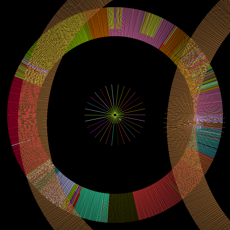
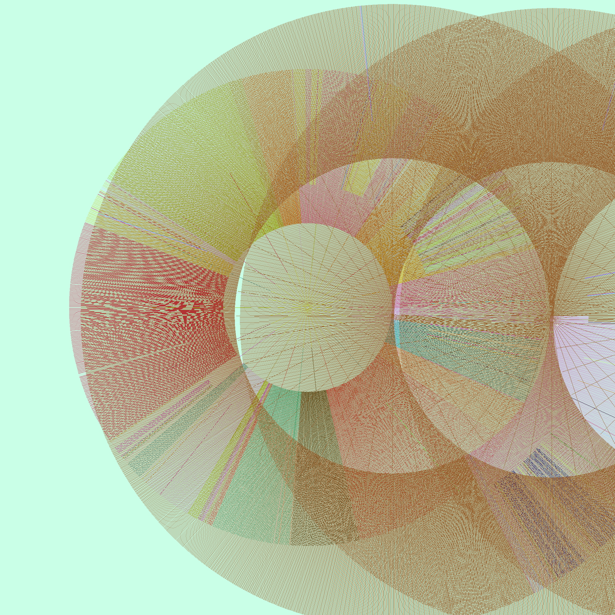
The Infome Imager allows the user to create "crawlers" (software robots, which could be thought of as automated Web browsers) that gather data from the Web, and it provides methods for visualizing the collected data. 


"The . project 1:1, created in 1999, consisted of a database that would eventually
contain the addresses of every website in the world and interfaces through
which to view and use the database. Crawlers (software robots, which could
be thought of as automated web-browsers) were sent out on the Internet to
determine whether there was a website at a specific IP address (the
numerical address all computers connected to the Internet use to identify
themselves). If a site existed, whether it was accessible to the public or not,
the address was stored in the database. The crawlers didn't start on the first
IP address going to the last. They searched instead for selected samples of
all the IP addresses, slowly zooming in on the numerical range. Because of
the interlaced nature of the search, the database could, in itself and at any
given point, be considered a snapshot or portrait of the Web, revealing not a
slice but an image of the Web with increasing resolution...


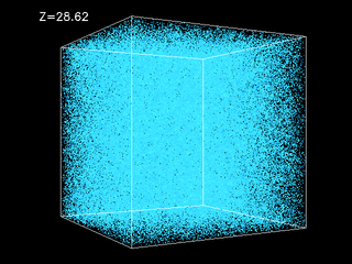
The image is composed of pixels each representing one website address stored in
the IP database. The location of a pixel is determined by the IP address it
represents. The lowest IP address in the database is represented in the top
left corner and the highest in the lower right. The color of a pixel is a direct
translation of the IP address it represents, the color value is created by using
the second part of the IP address for the red value, the third for the green,
and the fourth for the blue value. The variations in the complexity of the
striation patterns are indicative of the numerical distribution of websites
over the available spectrum. An uneven and varied topography is indicative
of larger gaps in the numerical space i.e. the servers represented there are
far apart, while smoother tonal transitions are indicative of networks hosting
many servers, which because of the density have similar IP addressesVisualization
The 1:1 and the Infome Imager visualizations are realistic in that they have
a direct correspondence to the reality they are mapping. Each visual element
has a one-to-one correlation to what it represents. The positioning, color,
and shape of the visual elements have one graspable function. Yet the
images are not realistic representations; they are real, objects for
interpretation, not interpretations. They should be experienced, not viewed
as dialogue about experience. This is interesting in several ways. On a more
fundamental level, it allows the image to teach us something about the data
by letting the complexity and information in the data itself emerge. It allows
us to use our vision to think. Secondary, it makes the visualizations function
as art in more interesting ways, connecting them to artistic traditions from
pre-modern art, such as cave paintings, to abstract expressionism, action
painting, minimalism, and to post-structuralist deconstructions of power
structures embedded in data. The visual look that follows from this thinking
is minimal. It is strict and “limited” in order not to impose its structure on its
possible interpretations and meanings. The visualizations avoid looking like
something we have seen before, or they playfully allude to some
recognizable form but yet slip away from it.
The abstract reality in which these images emerge is not a Platonist space of
ideal forms, and the images are not the shadows of such forms. The term
‘visualization’ is problematic, and would be beneficial to avoid, because it
indicates that the data has a pure existence, waiting to be translated into any
shape or sound (or whatever medium the latest techniques of
experiensalization would produce). The opposite view that argues that the
data is not there if we don’t experience it—could be fruitful as long as it is
not seen as a solipsist statement, but rather as a position more affiliated with
ideas from quantum mechanics. The Heisenberg uncertainty principle
implies that we can only be certain about something’s existence if we see it.
Everything else is known only with some degree of probability. In the first
of these arguments—the data-purist view, images are merely one possible
expression of the data behind it. The images get their meaning in a vertical
manner; the truth is in the data, outside the image, behind or below it. In the
second view, the contextualist stand, images cannot escape their context, the
methods producing them and the discourse they are produced within. They
get their meaning in a horizontal manner. The meaning is created from how
the image refers to its image-ness and the tradition in which it was created.
The most interesting examples of visuals displaying data, negotiate between
these opposite positions."
Inquiries in Infomics
Lisa Jevbratt (2004


DATA BEAUTIFUL - An Adventure in Info Aesthetics
Lev Manovich - From Jevbratt's website

"A Web crawler is beautiful. Quantitative data is beautiful. Multiple windows of GUI are beautiful. Email clients are beautiful. Instant Messenger is beautiful. Information is beautiful. 

Let the thousand data windows open; let the thousand gassian curves spring up; let the thousand pockets move through the network; let the thousand matrixes multiply themselves. Information tools and information interfaces is the future of aesthetics. 

Normally we think of Web crawler and data visualizations as functional tools. Web crawlers classify the Web; data visualization In contrast, we are told, art is non-functional. (Of course this rarely has been true: not only art routinely has been used to propagate various ideologies - Christianity, Capitalism, Communism - but artists also taught people how to interact with complex bodies of information. History of art is the history of research in information interfaces. Giotto was the leading information designer of his days.) 

So how can we make art out of a Web crawler and data visualization tools? In my project I de-functionalize them. 

Firstly, my Web crawler does not look for any particular "content"; its goal is simply to generate a data set, which will lead to a beautiful visualization. Whether this data set consists 

Secondly, I think of the "walk" crawler takes through the information space of the Web as an elaborate dance, and something beautiful in itself. In other words, the goal is to discover the beauty of the trajectory, rather than to treat this trajectory simply as a means to an end. 

Think of this as pure "data formalism." Modernists artists treated a figurative image as an abstraction, i.e., a collection of shapes, colors, lines which are arranged together and which also happen to represent some familiar reality. Similarly, behind the seemingly functional search trajectories and search results of Web crawlers lie abstract patterns, as beautiful as compositions of Kandinsky and Pollock, the shapes of Frank Gerry and Iseey Miyake, or the sounds of Philip Glass. 

Yet remember that this is just a first step towards discovering info-aesthetics. Ultimately we would not to submit information to the standards of conventional, classical beauty. Ultimately, we will have to discover what the new beauty of information is. It may turn out to have nothing to do with a smile of a girl on a beach or the shape of iMac or the machine-like sounds of Kraftwerk. If we are unlucky, it may be something that even our machines will find ugly. At this point, we just don't know yet."


Inquiries in Infomics
Lisa Jevbratt (2004)
Chapter in Network Art: Practices and Positions edited by Tom Corby,
Routledge 2005

"Infomics
Within the Infome, artist programmers are more land-artists than writers;
software are more earthworks than narratives. The ‘soil’ we move, displace,
and map is not the soil created by geological processes. It is made up of
language, communication protocols, and written agreements. The mapping 
and displacement of this ‘soil’ has the potential of inheriting, revealing, and 
questioning the political and economic assumptions that went into its 
construction. Moreover, this environment/organism is a fundamentally new 
type of reality where our methods and theories regarding expression, 
signification, and meaning beg to be redefined...

Imagine yourself flying over a landscape, your eyes following the mountain
ridges and the crevasses formed by water running down the slopes over
millions of years. (Figure 7.1) There are roads crossing the landscape, some
of them closely following the creeks and the valleys, some boldly breaking
the patterns of the landscape, laid on top of it as if drawn on a map. (Figure
7.2) There are circular fields, the result of the mechanics of manmade
irrigation systems, and oddly shaped fields wedged between lakes and
mountain slopes. It is a fascinating display of the interplay between nature
and culture, showing off the conditions of human life, our histories, and
philosophies of living and relationship to nature. Open any atlas and one
will see attempts to map this rich connection between geology and
anthropology. These images, the view from above and the maps, allows us
to see the layers of our environment, of how we have responded to the
geology, the climate we live in, and how we have manipulated nature
depending on our beliefs at different moments in time.
The Infome is made up of layers of protocols and languages, each
functioning as the nature, the conditions for the next layer, and all of them
together forming the conditions, the nature, which we relate to when
spending time in (for example by navigating the Web), or using (by sending
an email or transferring a file), the environment. We as people are expressed
in this environment as a collective through how we use it, just as flying over
a landscape reveals our cultures and their histories through the specific
placement of roads, the shape of the fields, and conglomeration of buildings.
In addition, we—humans —are also expressed in its very construction,
geology, and climate. We wrote its mountains and its rain....


The type of imagery produced in genetics and biochemistry, sometimes
called ‘peripheral evidences,’ are imprints of DNA and proteins.
 Two-dimensional polyacrylamide gelelectrophoresis, colorectal 
adenocarcinoma cell line


cDNA microarray. Daphnia Genomics Consortium.

These images are evidence of something outside themselves, something 
(truth?) that could be visualized in multiple ways. Yet, because they do not 
escape the methods used to create the imagery, what they articulate could 
not be said in any other way. Another beautiful example of this simple but 
complex type of representation is found on TV. The static we see on the TV 
screen when zapping through non-existing channels allows us to see the Big 
Bang, the birth of the universe (Figure 7.10). In the static, 1 per cent cosmic 
background radiation is hidden. The visual noise we see is not how we 
would choose to represent the Big Bang; it is not a visualization of it. It is in 
fact a direct experience of it...

A Shift
The trajectory through history to the computer as a symbolic manipulation 
machine led us through several more or less explicit mystical traditions and 
practices. It takes us from the Pythagoreans (500 BC) with their number 
mysticism and Plato (428-348 BC) and his ideal forms. It touches the 
universal art of Raymond Lull (1235-1316), a model of understanding that 
anticipated symbolic logic, and the memory art of Giordano Bruno (1548-
1600). These discourses served as a foundation for Gottfried Leibniz (1646-
1716) when he conceived of the lingua characteristica (a language that 
could formally express all knowledge), calculus ratiocinator (an allencompassing problem-solving machine/system) and his calculus.  
Leibniz’s work was highly influential on Charles Babbage (1791-1871) and 
his ideas leading to the Analytical Engine and George Boole (1815-64) and 
his theories of binary logic, both cornerstones in the development of modern 
day computers. The logic conveyed in all these traditions stems from a 
belief system where there are concepts and thoughts behind physical reality, 
a system of symbols more real than the reality experience by our senses. 
This symbolic layer can be manipulated and understood by modifying its 
symbols. There is a thought entity outside nature, a power that is either in 
the form of a god, gnosis, a oneness, or in the likeness of a god, as humans.
However, if computers are now the access-points to the Infome, and coding 
and code are processes and entities used to experience and manipulate the 
reality of a multi-layered environment/organism, then the metaphysical is no 
longer an all-knowing entity outside, dictating the system, but an 
emergence, an occurrence within it: a scent, a whisper, a path in-between 
for a shaman to uncover. And what she, or he, finds is not an absolute but a 
maybe, made of hints, suggestions, and openings."


A Prospect of the Sublime in Data Visualizations
(Slides and notes from presentation in Boulder 2005)
Lisa Jevbratt 2004/2005


"We look up at the starry sky and we sense a fear of not comprehending and being
engulfed, a fear of the unknown, and simultaneously we experience a longing for that
inaccessible, impenetrable darkness.
These are the classical visuals of the sublime. Images of a sense of grandeur we can’t
reach, which we can’t penetrate or grasp. It is in the very far distant, it is hidden in layers
of mist, or made inaccessible by a climate not suited for us, and it instills a sensation of
deep fear. Yet we urge for it, we are fascinated and attracted by it.


The datasets we are looking at now, data generated from looking in and down at us, the
earth and our technologies, are of no less dimension, vastness and grandeur than the
“datasets” that were the subject of the classical sublime: impressions of the nature out
there, the universe up there;  and the sensations of the sublime generated and described
by the romantic artist, philosophers and writers are of great interest to us when trying to
make sense of our datasets today whether it is through computation, analysis or, as in my
case, visualization.

Attraction/Repulsion
However, while the datasets of today are as substantial, complex and ungraspable as the
ones dealt with in the original romantic sublime, there is a difference in direction, and
also in the forces activated and the methods in which to engage the sublime.
In the original sublime the force operating in us is attraction. The object of desire is over
there, far away and we want to reach it. We want to go there, we are scared and
intimidated but our longing and effort is ‘towards’.
When our force (engine, energy, luck) fails the ship stops, it does not get closer. The
forces of nature push us away - we urge to approach.
One could say that the original sublime was the extreme tension, and the pain that tension
causes, of not knowing and wanting to know.
Now, looking in and down the force operating in us is reversed, its repulsion.
If the engine in a plane stops, it approaches the ground; the natural force is gravity and
we need to stay up and away. We are pulled down and respond by retracting. The forces
of nature pull us down and in, and we urge to repel.
The sublime now is the extreme tension, and the pain that tension causes, between
(hypothetical) familiarity - the earth is our home, the cells and DNA are in our bodies, the
networks are our creation - and a methodological distancing.
Let me explain this a little further using this slide.
True) <- (We   =   (False -> We)
The original sublime operated in an epistemological and ontological condition in which
there was a separation between us and whatever it is was we wanted to know something
about, just as it was a split between culture and nature. And, we were certain there was
something to know out there, outside ourselves and to be able to gain knowledge about it
we needed to approach it. Today, we have a somewhat inverted epistemological and
ontological condition and thus the sublime that operates within it is an inverted sublime.
We know now, learning from fields as varied as post-structuralism and quantum physics,
that we are always part of the system we are looking at. The way we look at something
changes the thing we are looking at. We also know that, by looking at something we will
potentially know less about it. I recently heard an astronomer mention in a talk that we
know approximately what 3 percent of the universe is, what it consist of. Just a few years
ago that number was 5 percent. The logical response to this inverted
epistemological/ontological condition is that we now need to retract. Not approach.
In the original sublime we wanted to go “there” because we wanted to know.
In the inverted sublime we don’t want to go there because we don’t want to not know.11
So why are we trying to find methods that are allowing the sublime to operate today?
And what could those methods be?
Esthetic decision-making
In the article “Systems Esthetics” from 1968, its author, Jack Burnham, wrote about the
new complex process or systems oriented society, culture and economics he saw
emerging: a new era in which a new form of systems analysis would be the most relevant
method for making understandings in any discourse. Burnham argues that because we
can’t grasp all the details of our highly complex systems (economical, cultural, technical,
etc), we cannot make “rational” decisions within them or understand them by analyzing
the parts or even the system.  The way to make decisions within them and to understand
them is by making more intuitive, “esthetic decisions”, a concept he borrows from the
economist J. K. Galbraith.
This idea has an intriguing parallel in the philosopher Emmanuel Kant’s reasoning about
the mobilizing effect the sublime has on our organizing abilities. Kant claims that in
experiencing the sublime, by facing large amounts of information, huge distances and
ungraspable quantities, our senses and our organizing abilities are mobilized. Contrary to
what might be believed, we feel empowered, able to make decisions, and capable to act.
This is of great interest to the field of data visualization. Many strategies for aiding
people in the task of turning any large set of data into knowledge assumes that they
should be presented less information and fewer options in order to be able to make sense
out of the data.
However, humans are capable of sorting through enormous amounts of visual
information and make sensible and complex decisions in a split second, (the ability of
driving a car is one example). Supported by Kant’s idea I propose that under the right
circumstances, drawing on sensations of the sublime, people can, when faced with huge
quantities of data, be mobilized to make intuitive understandings of the data. Many
information visualizations, artistic or scientific, are a result of the mistake of compressing
the information too much and decreasing the amount of information through calculations
that embody assumptions that are never explained. The most common mistake in data
visualizations is not too much information but too little, their “images” of the data
landscape are not high resolution enough for an esthetic decision to be made."