Information is Beautiful
I found information is beautiful a few months ago and loved it, but have recently rediscovered it as my work creeps towards data visualisation. It is a site run by David Mccandless where he puts his own work alongside other top data visualisation artist's work.
Here is his TED lecture...
Aside from it being a promising area for my project I think it might be inevitable that this is the sort of thing I will keep making as an artist. I mentioned ages back that I find myself visualising information without realising, with a diagram of my housemates - putting the weirdest things like relationships into graphs. But I am not alone, not by a long way!
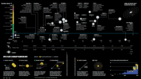
There are lots of artists and designers using the most unusual data for the most beautiful visualisations.
Not only that, but of course some of this data is about space!


What's great about informationisbeatiful.net is that David Mcandless goes through all the steps of his design process and talks in a very accessible way. It was his friendly vibe that made me decide to send him an email letting him know that I am available to come and help or just see what he's up to, if he'll have me. He replied to say that they aren't taking on people at the moment but to send him my CV anyway. He said he liked my 'Dozens' installation!
Jer Thorp is another similar artist who has been inspiring me along similar lines.
Jer Thorp is another similar artist who has been inspiring me along similar lines.
Jer Thorp has a bunch of tutorials for using Processing - the program which he uses to make his visualisations.
I have had a bash at processing, using a few tutorials online. I can make a few things happen like automatically save images of an animation, which at the most basic looks like this
Using Jer Thorp's tutorial I have also managed to use his spreadsheets of data (on google spreadsheets) to make pretty graphs.
So I *may* take this further, either way it is useful to have a vague understanding so that I don't have to restrict myself with my ideas - anything is possible! I found it strangely exciting to be able to type words out and get the computer to draw things.
The point I think for me is that I was saying how a lot of my work so far has been relevant to space or science, but not factual or precise. This sort of thing can allow me to make very similar work but using actual data - so it can be informative instead of just pretty.
and is there a way of representing this same sort of data in a 3D space? With LEDs or holograms or something?
These ideas plus interactive installation = my next idea..?Using Jer Thorp's tutorial I have also managed to use his spreadsheets of data (on google spreadsheets) to make pretty graphs.
So I *may* take this further, either way it is useful to have a vague understanding so that I don't have to restrict myself with my ideas - anything is possible! I found it strangely exciting to be able to type words out and get the computer to draw things.
The point I think for me is that I was saying how a lot of my work so far has been relevant to space or science, but not factual or precise. This sort of thing can allow me to make very similar work but using actual data - so it can be informative instead of just pretty.
Anyway I'm now trying to document all the weird visualisation ideas that I get without noticing - here is a start:
what was the earth like where I am sitting, 100 years ago, 1000, a million?
what colour would the light from the windows go / our sitting rooms go when the sun expands?
what areas of space would glow if they glowed more when you stood in them?
what if you could visualise every single click you make online etc. (like in ted hiebert's lecture)
and is there a way of representing this same sort of data in a 3D space? With LEDs or holograms or something?
Along with his own work, Jer Thorp blogs about any other great data visualisations out there, like this one which I sadly can't embed
...which combines space, data AND synaesthesia.
...which combines space, data AND synaesthesia.


No comments:
Post a Comment